utropia
Six islands.
Two products.
One marketplace.
01 · The problem
A market without an index
The Dutch Caribbean is one market spread across six islands, and it had never been indexed. Listings lived on individual agency sites, in classified groups and in inboxes — so a buyer weighing Sint Maarten against Saint Martin was really comparing six different websites, and an agency's best property was invisible to anyone who had not already found the agency.
Utropia had to be two products at once: a marketplace that finally made the region searchable, and the back office the agencies would actually keep their listings in. Neither works alone. A marketplace with no listings is empty, and a console nobody publishes from is a spreadsheet with extra steps.
- No single index
- Six islands, six sets of agency sites. Nothing let a buyer compare across them, and nothing told an agency whether their listing was being seen at all.
- Every listing shaped differently
- Area, category, currency and type were recorded per agency. Rolling that into one searchable index meant agreeing on a schema before anyone could agree on a screen.
- Two audiences, opposite needs
- Buyers arrive on a phone, from abroad, browsing. Agents sit at a desk all day and need density. The same listing has to be a postcard on one side and a row in a table on the other.
02 · The marketplace
One search, six islands
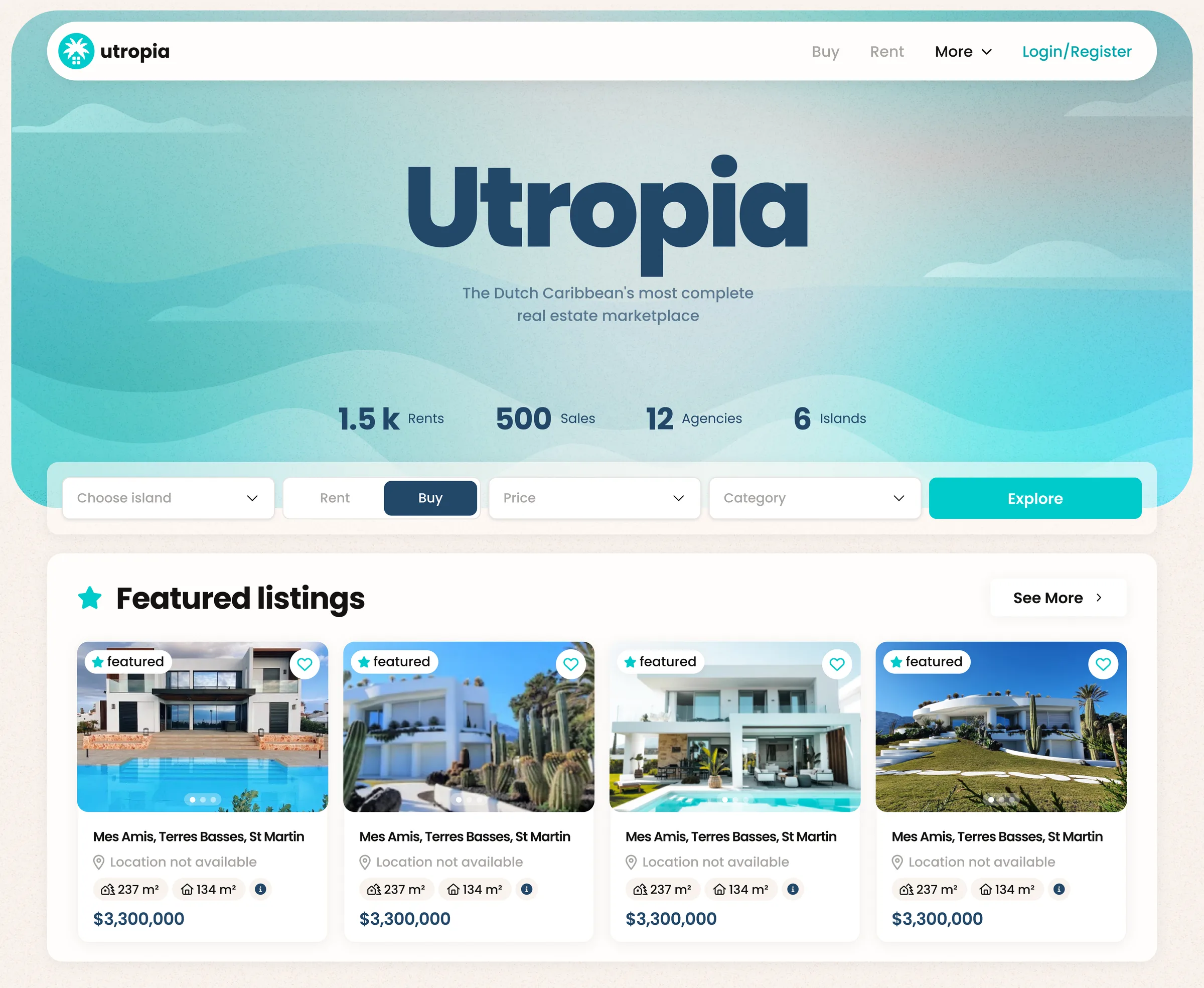
The landing page has one job: make the whole region searchable from a single row of controls. Island, rent or buy, price, category — four decisions, then Explore. Nothing is nested behind an advanced panel, because the first search a stranger runs is the one that decides whether the index is worth anything.
Everything else on the page is evidence that the index is real. The counters sit directly under the wordmark, and the featured listings below them are whole cards — gallery, plot and built area, location, price — so the first scroll already shows what a result will look like.
- Search
- Island · rent/buy · price · category
- Card
- Gallery, plot & built area, price
- Counters
- 1.5k rents · 500 sales
- Reach
- 12 agencies · 6 islands
03 · Narrowing it down
Four fields on the way in, thirty once you're inside
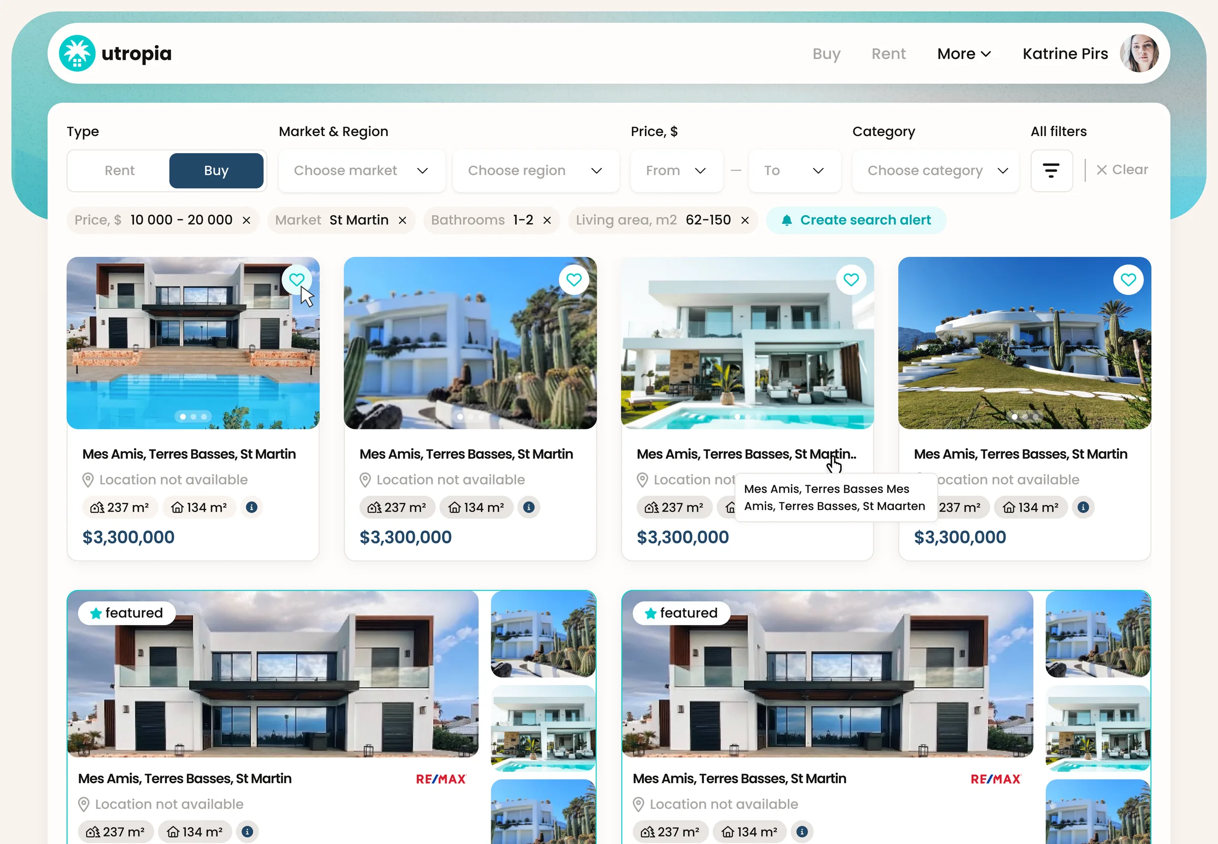
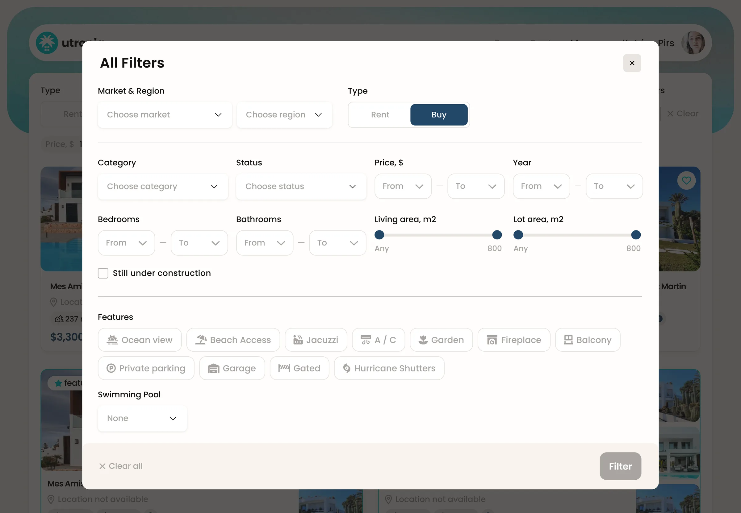
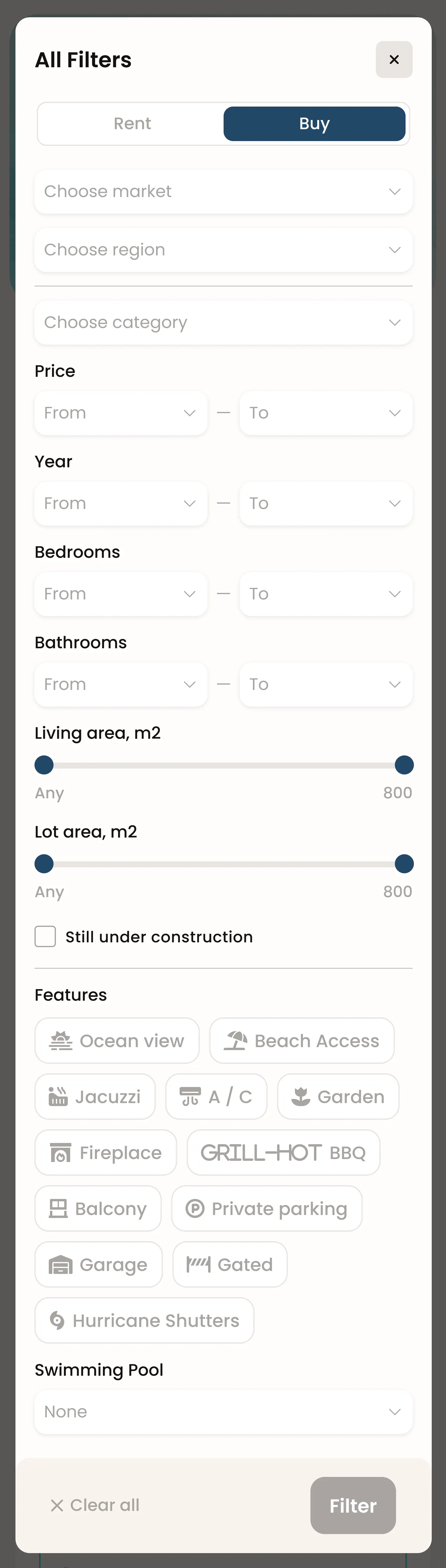
The landing search is deliberately short. Results are where the real filter set lives, and it arrives in two tiers: the row along the top carries the four decisions almost every search makes — type, market and region, price, category — while everything else sits one click away behind All filters.
What is currently applied comes back as removable chips under the bar. That matters more here than on a mainland portal: a query that crosses islands, currencies and property types gets complicated fast, and a chip you can read and delete is the difference between narrowing a search and starting it over.
The filter vocabulary is regional rather than generic. Ocean view, beach access, gated, hurricane shutters — these are the questions a Caribbean buyer actually asks, and none of them exist on an off-the-shelf listing schema.
- Top bar
- Type · market & region · price · category
- All filters
- Status, year, beds, baths, areas
- Features
- 11 chips + swimming pool
- Standing
- Any search becomes an alert
04 · Finding a place
Scanning by geography, not by list
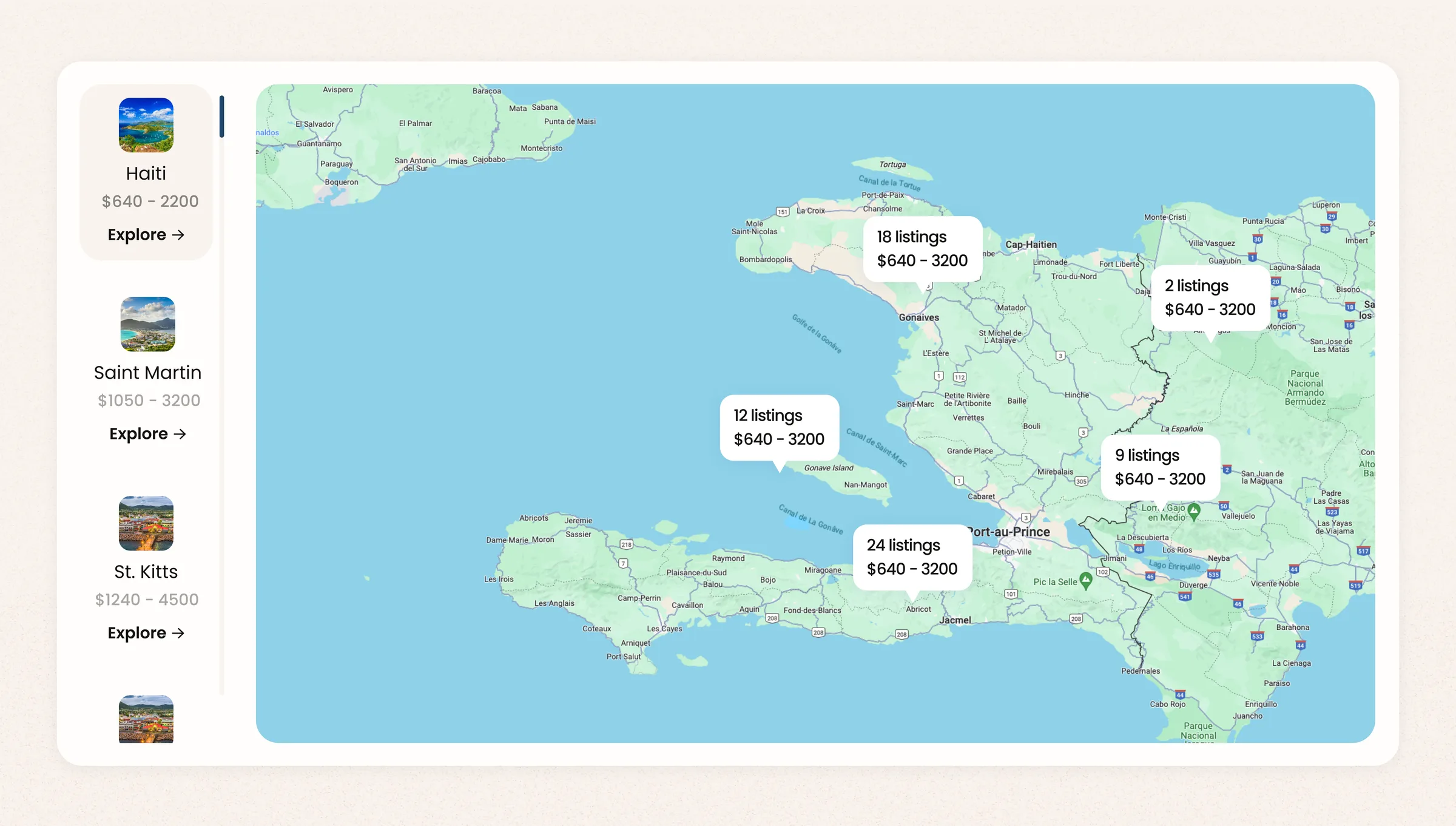
In a region, geography is the first filter — not price, not category. Somebody shopping the Caribbean is choosing an island before they are choosing a house, so browsing starts on a map rather than on page one of a list.
The rail down the left carries a price range per island, which is the cheapest possible way to rule one out: you can see that St. Kitts starts at $1,240 and Haiti at $640 without opening either. On the map itself, listings collapse into clusters that carry the count and the range together, so a zoomed-out view still answers "how much, and how many".
05 · The listing
Everything a buyer 4,000 miles away has to decide on
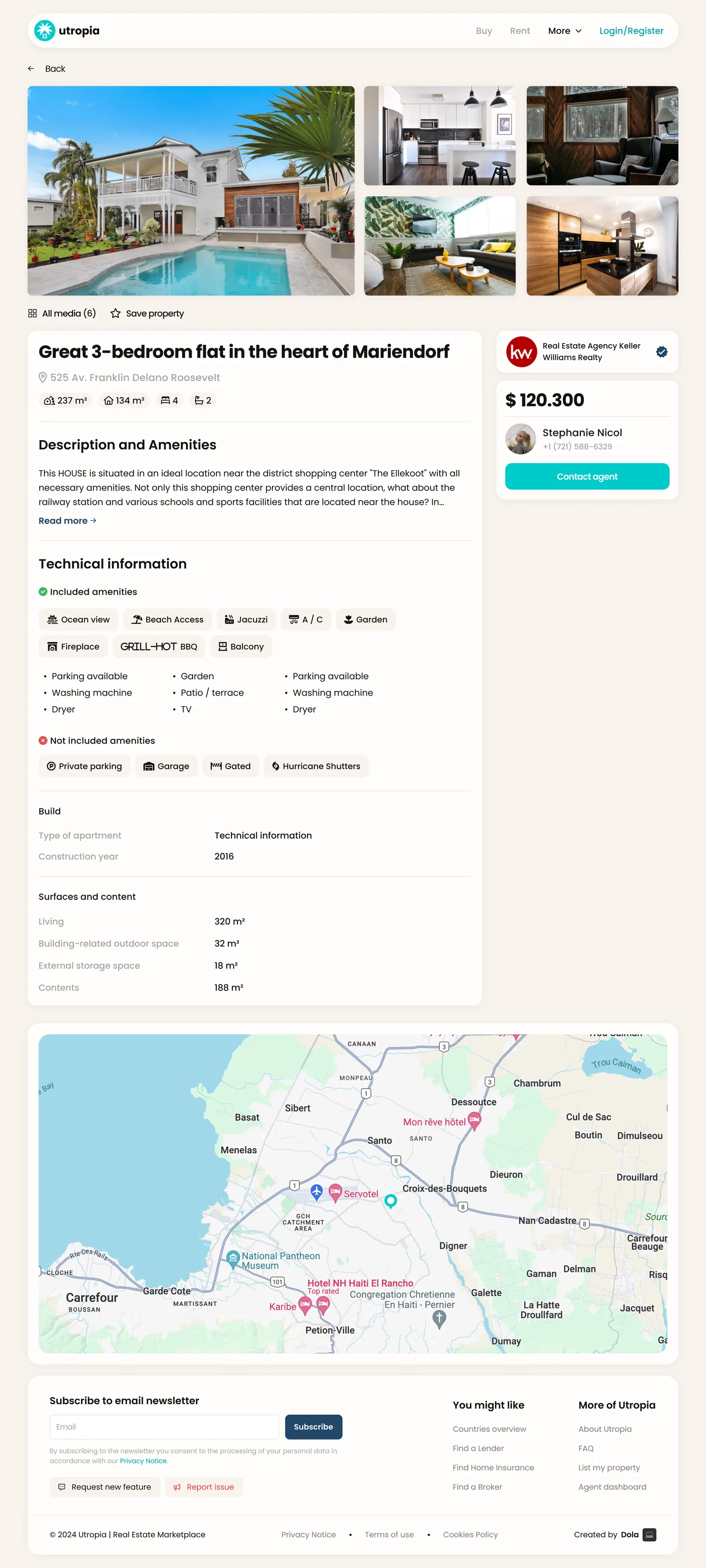
Most people buying here will not walk the property before they enquire. The listing page has to carry the whole viewing: gallery first, then the four numbers that get compared — plot, built area, bedrooms, bathrooms — then the long technical read for anyone who is serious.
The part I care about most is the pair of amenity blocks. Included amenities and not included amenities are both listed, both with icons, both explicit. Every listing site tells you a property has a garden; almost none will tell you it has no garage or no hurricane shutters. Saying it plainly costs a little enthusiasm on the page and saves a wasted enquiry on both sides.
06 · The agency side
The console behind the listings
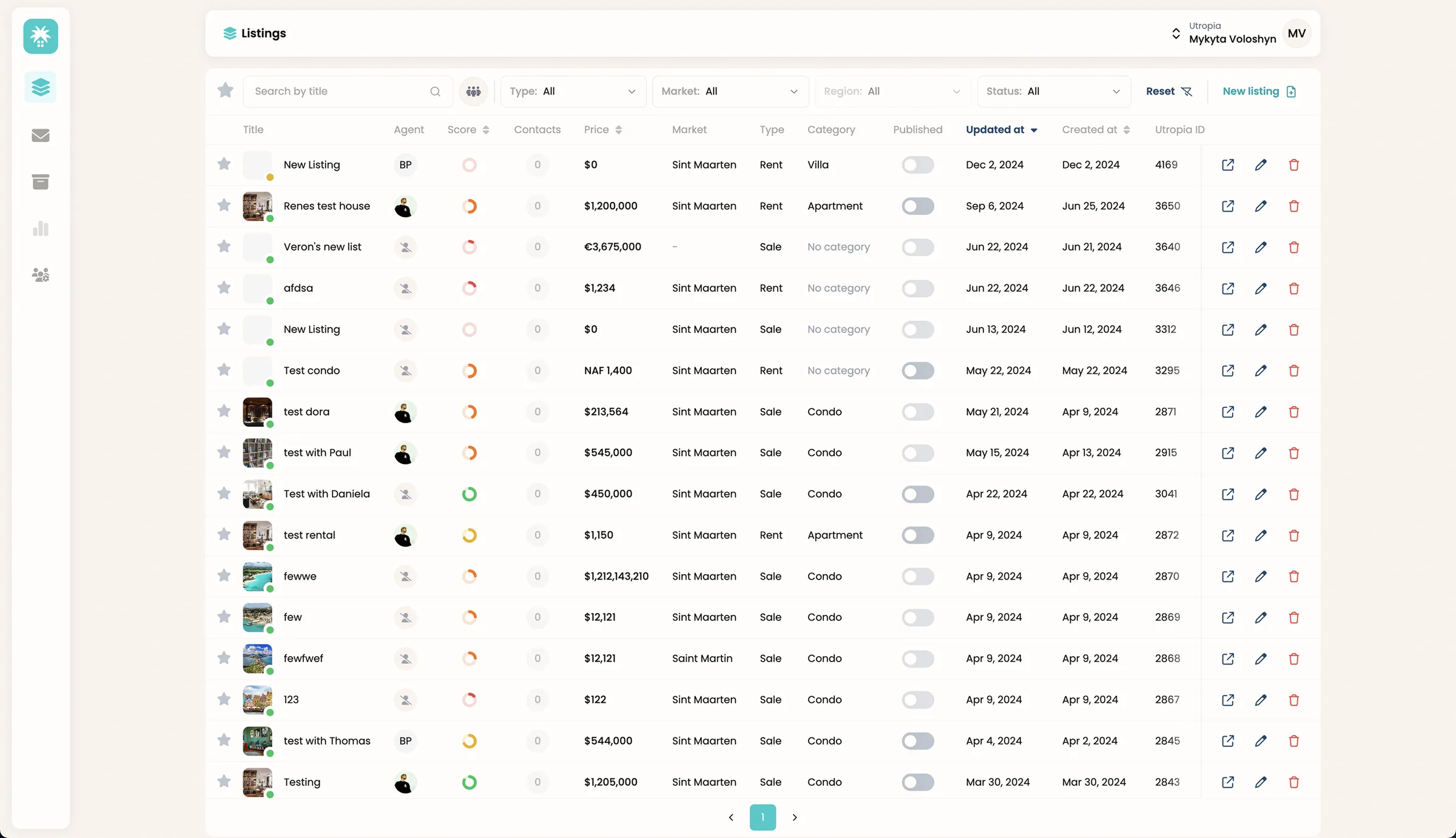
The marketplace is only as good as the console feeding it. Agencies do not maintain an index because a product asks them to — they maintain it if the tool is faster than the spreadsheet it replaces. So the console is one table, and everything an agent acts on lives in the row.
Title, agent, completeness, contacts, price, market, type, category, published state, both timestamps, and the Utropia ID — visible at once, sortable on the columns that matter, filterable down to a single market. Publishing is a toggle in the row, not a workflow behind a screen.
07 · The system
One library, two products
A marketplace and a back office look nothing alike, and that is exactly why they had to be built out of the same parts. Two products drawn separately drift within a release; two products drawn from one library stay recognisably the same company even when one is a beach photo and the other is a table.
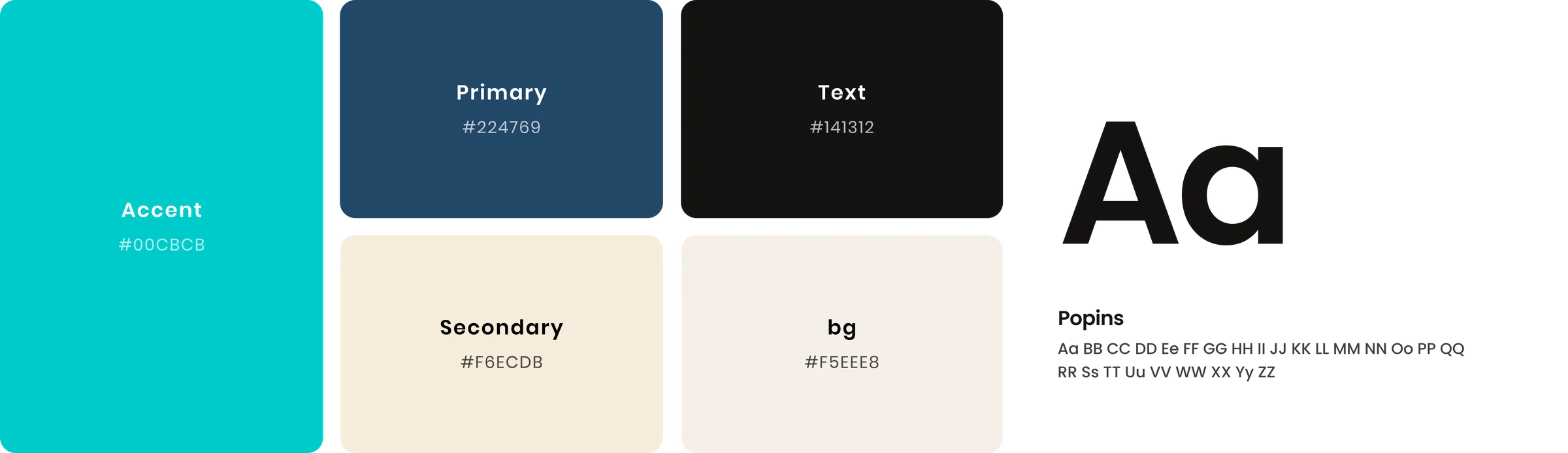
Five colours carry both. Teal is the only thing that ever asks to be clicked, navy does structure and headings, and the two warm neutrals are the ground everything else sits on. Poppins runs from the marketplace's display sizes down to the console's 12 px table labels without a second face.
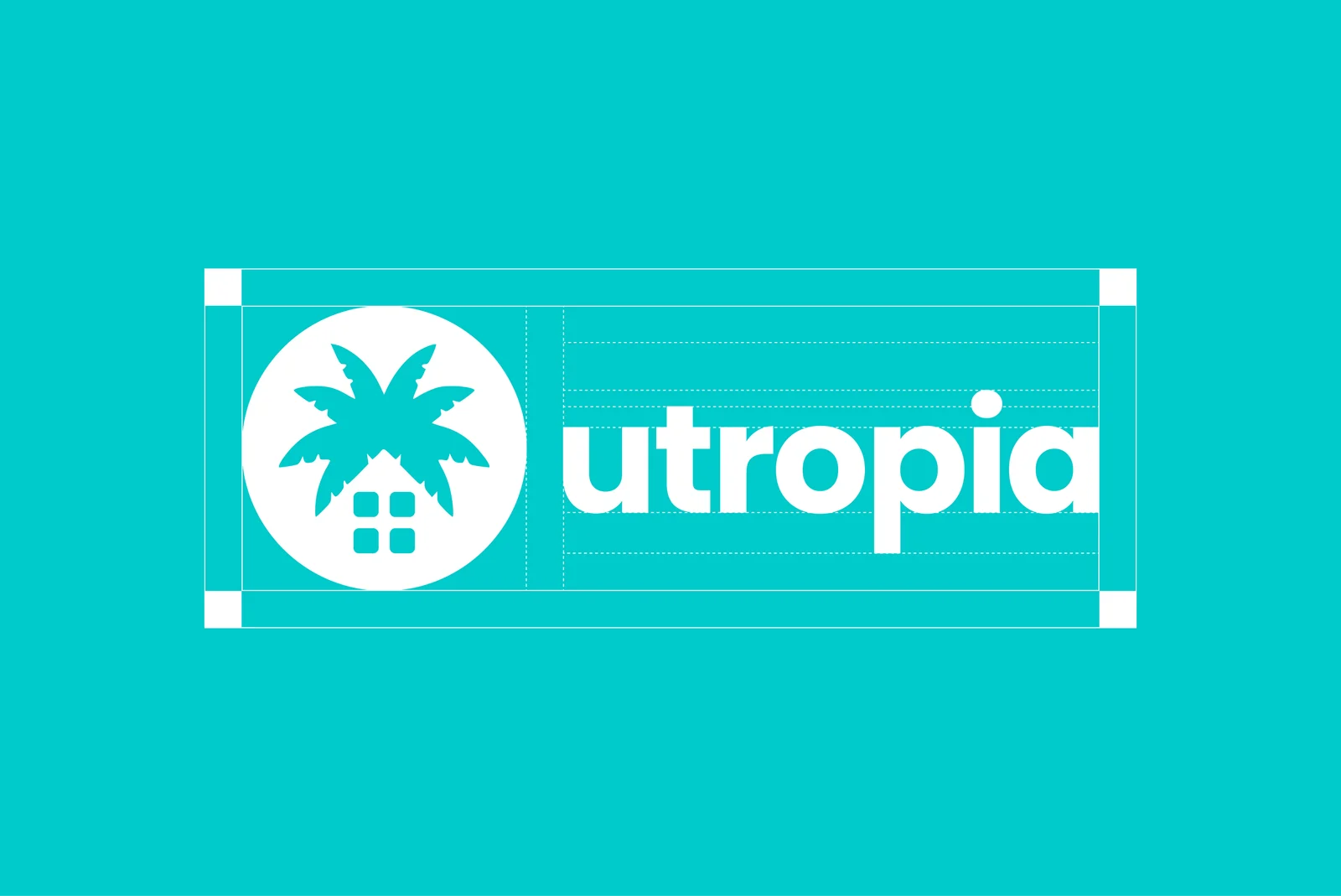
The mark is a palm over a house — the two things the product is actually about, drawn as one glyph. It is specced on a grid so the lockup survives being set at 32 px in a console sidebar and at display size on the landing hero, and it ships in both a knockout and a solid-circle build for the light and dark surfaces it has to sit on.
- Accent
- #00CBCB
- Primary
- #224769
- Surface
- #F5EEE8 · #F6ECDB
- Type
- Poppins
- States
- Drawn, not described

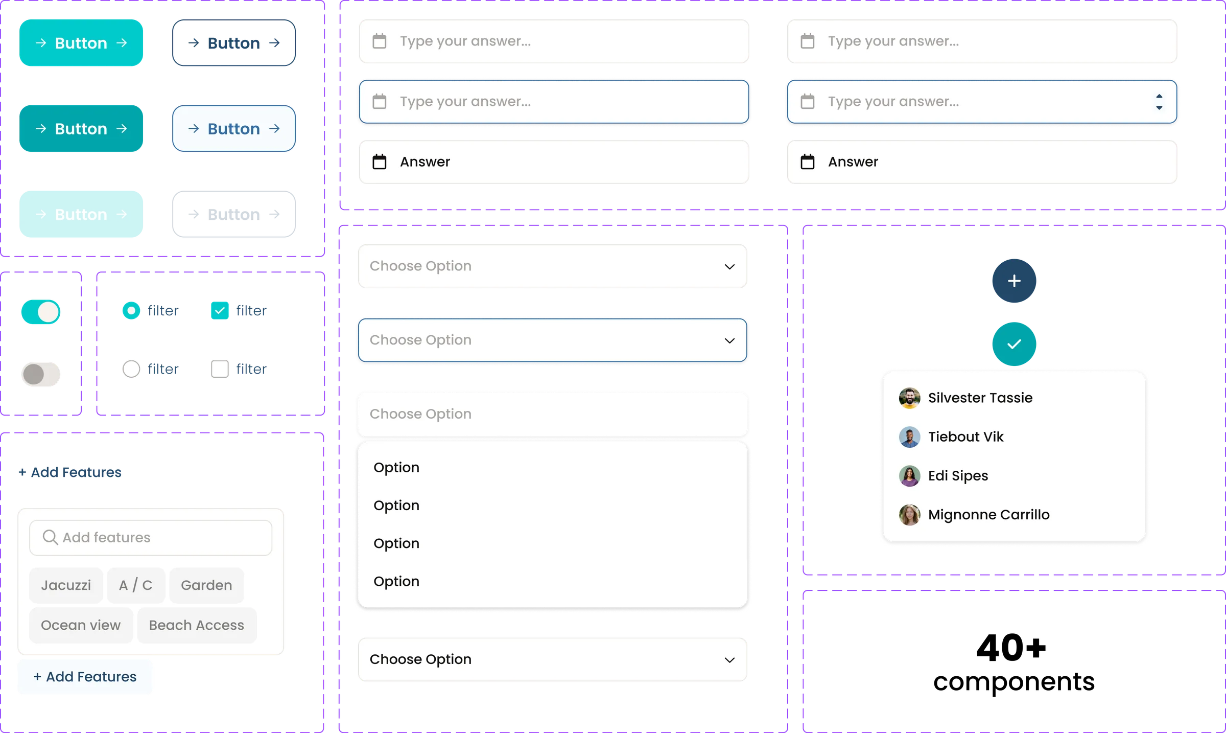
Under the tokens sits the part that actually did the work: a component set drawn with its states in the file, not left to be improvised in code. Buttons exist as filled and outlined, each in three states. Inputs and selects are drawn at rest, focused and filled — the focus ring is a real specimen rather than a note in a handover doc. The console's assignment popover and the marketplace's feature picker are both here, because a search chip and an admin field turned out to be the same component with different copy.
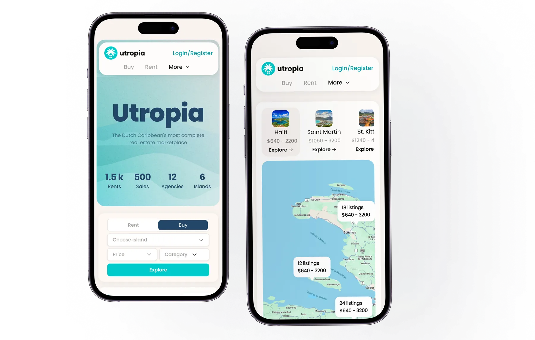
The rest of the marketplace reflows the same way. Results go one card per row and the filter bar shrinks to a type toggle and an icon, with the applied chips wrapping under it — so the query is still readable on a 375 px screen. The map does not disappear; it becomes a Show Map button floating over the results, because on a phone the list and the map cannot share a viewport and one of them has to be a mode. All Filters becomes a full-height sheet rather than a modal, and the listing page keeps every block it has on the desktop — but not in the same order. The agent card is a sticky rail on a wide screen; stacked, that would drop it to the bottom, so it moves up under the gallery and repeats at the end. Reflowing a layout is not the same job as re-ranking it.


08 · Outcome
What it added up to
Two products shipped off one library, and a region that had never been searchable in one place became one index.